
Tunein is a music streaming app for everyone and their own personal music tastes. After being on the market for the past couple years, we’ve established a solid audience, with over a million users streaming their music for free. Due to this established market, we want to introduce a premium feature in which users can subscribe and pay a monthly fee. By designing a way to offer this premium feature to our users, both new and returning, we can receive a larger profit margin and help us grow as a business.
Role: Sole Researcher and Designer
Details: Springboard Ui/UX Capstone Project
Time: February 2023 - April 2023
Tools: Figma, Miro
tunein: From free to freenium
Problem
Identify and implement a successful method(s) and motivation of encouraging users to join premium, whether new user or established user, without driving them away
Outcomes
• Interviews with regular music listeners about their experiences and thoughts regarding premium on streaming apps
• Affinity map to synthesize findings from interviews
• Sketches, wireframes, and hi-fidelity screens of designs
• An interactive prototype that seamlessly introduces and promotes premium to users without being too intrusive
I conducted 5 in-person interviews with avid music listeners and Spotify users. I aimed to ask two important points:
1) Why did they premium? (Driving factors, motivations, thoughts, etc.)
2) Why did they NOT get premium? (If they're a free user)
Unfortunately, question 2 would remain elusive as they all have Premium. They can't remember what it was like when they were a free user.
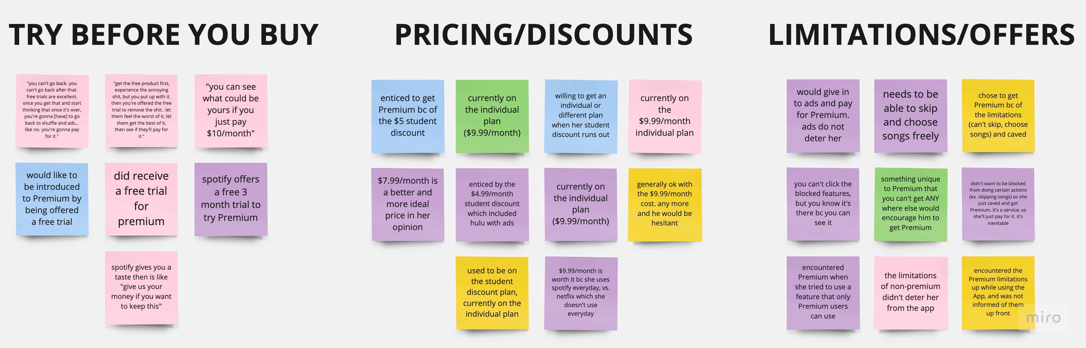
I synthesized my findings into an affinity map.
Given this information, I made it our goal to focus on introducing something pleasant (like having additional features and more control of the music they listen to) rather than removing something unpleasant (ads).
Additionally, a different aspect to consider was the price. Discounts and free trials proved to be successful.
How might we strike the perfect balance between a delightful music journey and respecting our users' budgets?
Listening to Users' First
The biggest factors in upgrading to Premium was removing ads and gaining access to additional features/more control.
Premium will be introduced strategically within these flows:
With the enticement of flexible payments and access to features we aim to allure users to upgrade to Premium
As one of my interviewees emphasized:
In order to really stand out from our competition, I aimed to unveil what current music streaming platforms were missing. What do users want?
Surprisingly, the two things that came to interviewees' minds were access to user-uploaded/created niche songs and the ability to add multiple songs at once to a playlist. As of conducting this project, only Spotify on desktop allows this feature for playlists. For the user-uploaded/niche songs, the idea is similar to Youtube. There are those obscure songs you can only find on Youtube that you won't find on Spotify as Spotify focuses more on labeled artists.
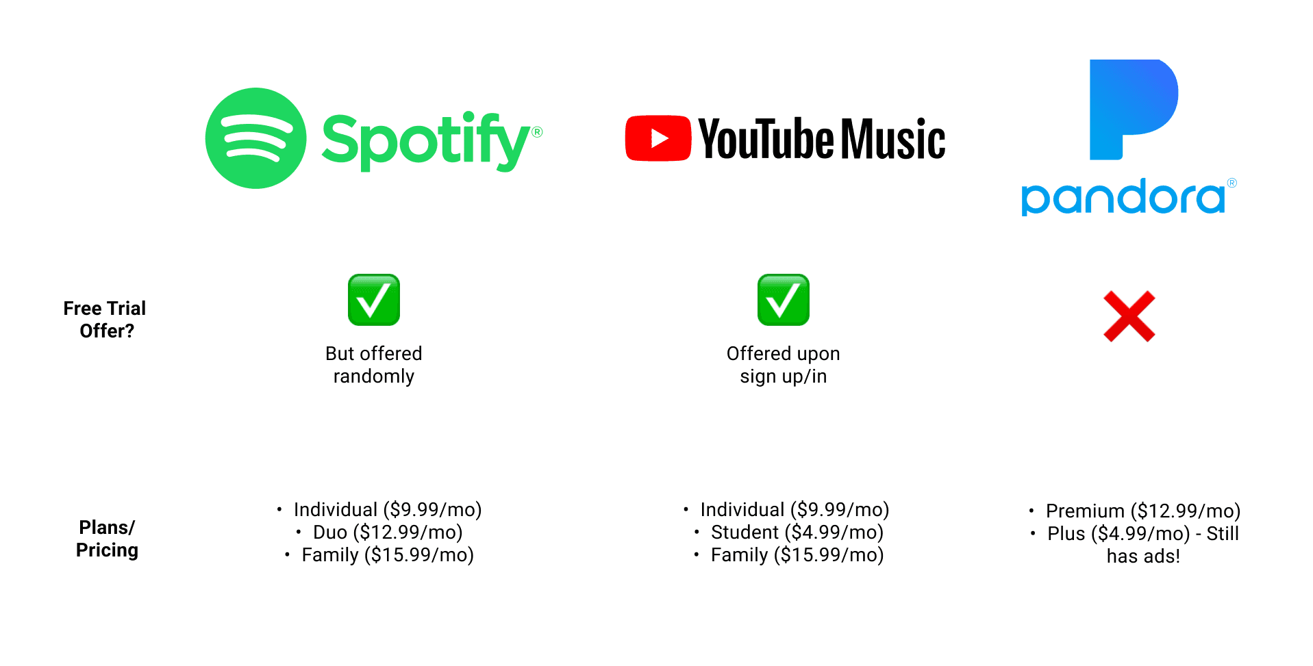
To get a comprehensive understanding of what truly works, I decided to experience these music streaming apps firsthand. In addition to Spotify, I explored two other major players in the music streaming arena: YouTube Music and Pandora and conducted a small comparative analysis.
It was clear that I had to make sure that the free trial was explicitly available and offered. Side note: I can't believe that there are two different payment plans for Pandora, and for one of them you still get ads. $4.99 to watch ads. What a world we live in.
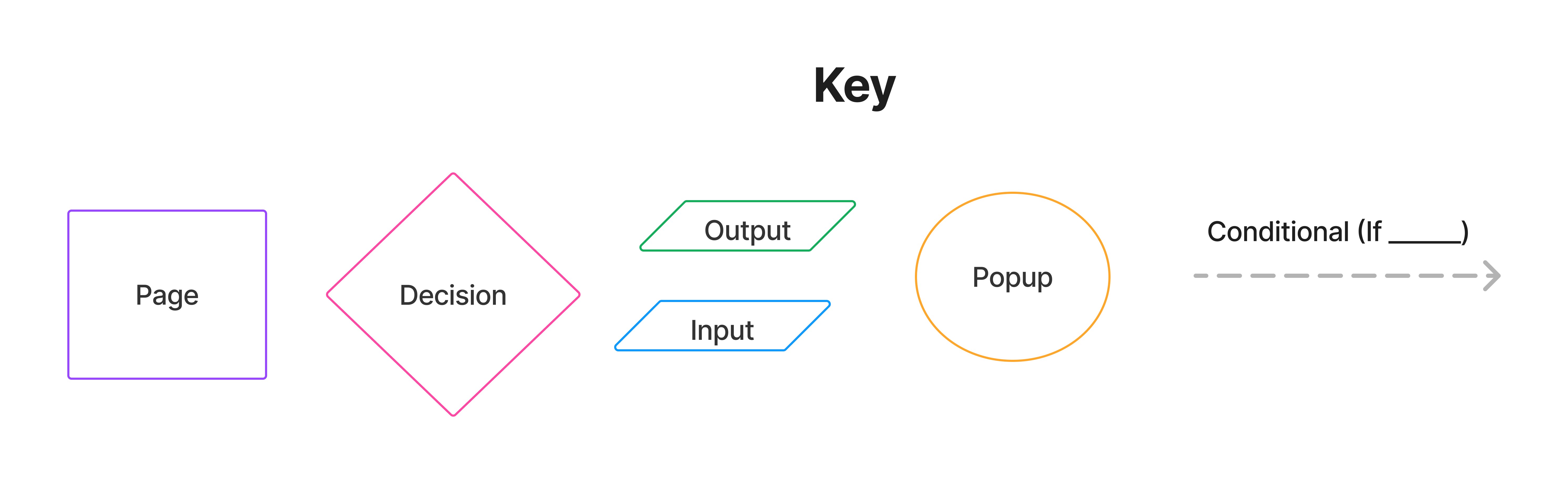
In order to pursue and streamline the user experience and introduce TuneIn Premium seamlessly, I meticulously crafted a detailed flowchart. It delineates the user's journey within the app, considering various scenarios and options.
The flowchart encompasses three key red routes based on interviews and our requirements:
Flow 1: Registration and Sign-In
User Types: The user is categorized as either a Returning User or a New User.
Premium Offering: During the registration process, New Users are presented with a special discount offer to entice them into considering TuneIn Premium. In contrast, Returning Users will not receive a discount offer.
Outcome: The user proceeds through the app as either a Non-Premium or Premium member, contingent upon their subscription choice during registration.
Flow 2: Browsing the App (Listening to/Finding Music)
User Intent: The user may have a specific song in mind to listen to or may be exploring for new music.
Experience: The browsing experience adapts based on whether the user is a Premium or Non-Premium member. At appropriate junctures, Premium may be offered to Non-Premium users when they attempt to access premium features.
Flow 3: Making a Playlist
User Intent: Creating playlists is a key feature, and this flow is relatively straightforward.
Consistency: In contrast to the other flows, the user's experience remains consistent, regardless of their subscription status
Feature Access: Whenever a user attempts to access a Premium feature, we seize the opportunity to present Premium as a solution.
Home Feed Promotions: Users will receive Premium offers on their home feed after completing specific actions within the app, reinforcing the value proposition.
Registration and Sign-In: The registration and sign-in processes offer prime moments to introduce TuneIn Premium to potential subscribers.
This comprehensive approach ensures that Premium is introduced contextually, enhancing the user experience and conveying its value at the right time.
I decided to introduce Premium during registration/sign-in and within the app itself as that is the standard among apps. Given that most users rarely log out of their accounts on their personal devices, the act of simply opening the app was considered a part of the sign-in experience.
The primary motivator our users expressed for considering TuneIn Premium was the desire to eliminate ads.
To integrate this motivation, we took advantage of our Premium prompts and opportunities into visual pop-up ads. Because auditory ads can disrupt the listening experience, we chose a visual approach to maintain the flow of users' music journeys. By doing so, we not only align with user preferences but also avoid real product or service ads, which can be found on other platforms.
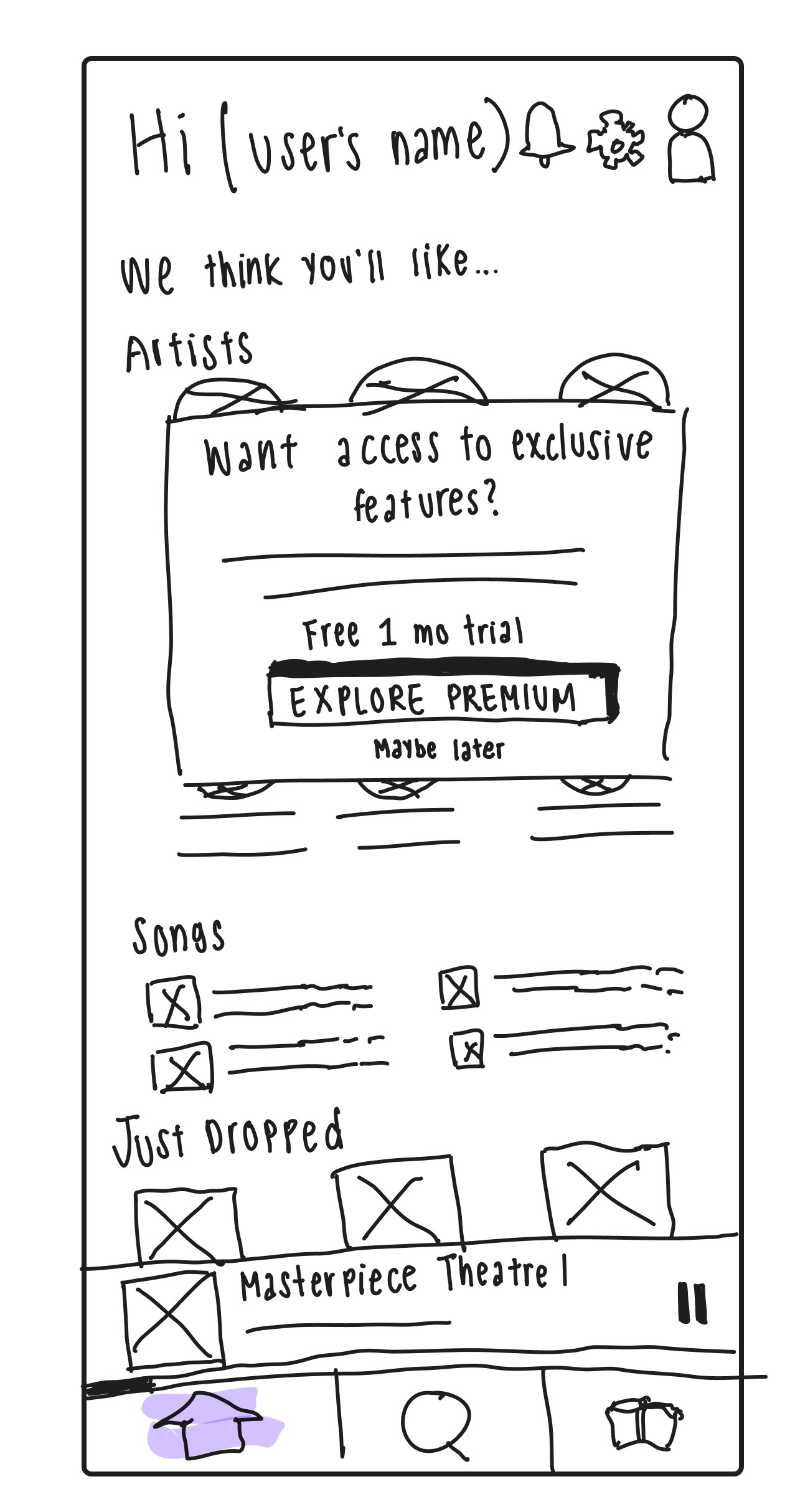
Premium opportunity pop-up sketch
I embarked on sketching as a creative endeavor to pour my ideas onto paper. The goal was to envision how TuneIn Premium features would seamlessly integrate into the app.
For a closer look at these sketches, please click here
For this Browsing the app flow, I prototyped these screens so that when going through these screens, the user finds a new song first, and then they search for a specific song
For a closer look at these wireframes, please click here
" [Once you get the free experience] you can’t go back. You can’t go back after that. Free trials: excellent. Once you get that and you think about once it’s over, you’re gonna go back to shuffle and ads like no. You’re gonna start paying for it [after].”
— Lynn

Excerpts of affinity map
Comparing 3 popular music streaming apps


User flows of Red Routes

What really works?
Plan of Action
Navigating tunein
Sketching
Wireframes
Did it work?
Try Before You Buy
Pop-up Problems
Tag Trouble
Playlist Expectations
Truly Free Free Trial
Final Free to Freenium Designs
I said these were the final designs.
Just kidding.
While this was the end of my project, I am aware that this is far from the end as there is still so much that could be improved.
Types of users of tunein and their pathways


Sketches of User Flows


Wireframes of Flows
Testing involved five peers and friends through online sessions, conducted via Zoom. The objective was to emulate the user experience on a mobile device, our app's primary platform. This approach would allow us to observe physical interactions like swiping, dragging, and pinching, which are integral to the mobile experience. However, unfortunately, I was not able to conduct the tests on the users’ phones.
While we want introduce the Premium opportunity to both Returning and New Users, testing was primarily conducted with New Users. These participants were directed to register as if they had never encountered the app before, and the emphasis was on engaging them in the Premium experience. I had concerns that if tested as Returning Users, participants might not immerse themselves in the user experience, potentially affecting the authenticity of their feedback.
A big complaint users voiced during testing was that during Registration, they wanted to experience the app's free, non-Premium version before committing to a subscription payment.
I adapted to shift my perspective. Instead of focusing on users "experiencing" the app, I reframed it.
This shift in thinking aimed to provide users with a clearer picture of what TuneIn Premium offers, with hope it focuses on and gives what the users want instead of what we can offer.
Unsurprisingly, the pop-up visual ad wasn't well received. Users found it extremely annoying and intrusive to their listening experience despite it being a visual ad and not auditory. I really went overboard with them and should've known better. Oops.
The "Tags" page in the playlist flow was also identified as a point of confusion. I originally inputted the Premium offer directly onto the screen for a more direct and clear opportunity for the user. However, that backfired on me as it wasn't made clear on how to proceed with making their playlist. The "Maybe Later" dismissing Premium isn't associated with moving to the next screen. To enhance clarity and user-friendliness, it was decided to display the Premium pop-up only when a user selected a tag, in line with user feedback about their preferences for Premium prompts.
When creating a playlist, users initially expected to be able to add the song they're currently listening to directly from the music player screen, which isn't how I prototyped the designs. After making the change, users then expected to be able to go to the search results to search for more songs and be able to add them directly from the search results.
They expected to see a sort of (•••) icon on each song listed in the search results that would allow them to add the song directly to the playlist. This method was seen as more convenient and less disruptive since they wouldn't have to access the music player and play the song they wanted to add.
However, this introduces a glaring problem. Specifically regarding the Premium feature of being able to add multiple songs at once while creating a playlist. Originally, when users go to their Playlist library and add songs to a playlist, the Premium popup for adding multiple songs at once appears when the user tries to do so. They have to manually press the (+) button next to the song, then press a "Add song" button. In other words, two buttons are required to add one song, thus four buttons for two songs. For Premium users, they can select multiple songs at once (two + buttons, one for each song) and then press "Add songs" button, so three buttons total for two songs. Imagine how much quicker it would be if it were a larger playlist, like 25 songs.
But if the user can just go to the search results to add songs to a playlist, this whole feature and advertising of Premium within the Playlist page is deemed unnecessary and unknown.
I adapted accordingly: since users wouldn't see any Premium pop-up when adding songs to their playlist in the search results page, we can take advantage of this. After they've finished adding the two songs in the search results and head to the Library page to view their finished playlist, we can show the pop-up. Their previous search will be saved too. But if they choose to go to the Library to add the 2 songs, they will not see the Premium tooltip afterwards. They already saw it when they tried to add multiple songs at once. This exemplifies the constant adaptation and fine-tuning involved in creating an intuitive user experience.
Surprisingly, the free trial opportunity encountered hesitation from users. Some of them didn't even notice the free trial, and when it was pointed out to them, they expressed concerns.
The idea of a free trial, despite its advantages, seemed like an extra hassle for them. Users worried about remembering to cancel the trial to avoid future charges and potential inconveniences.The challenge of offering both a discount and a free trial to New users led to an intricate decision. To address this, the discount was introduced in the Registration/Sign-in Flow as an initial enticement. After that, users were encouraged with the free trial offer throughout the rest of the experience. The idea was to make both options available to New users while ensuring they received some form of discount.
The 1-month free trial was designed to be a seamless entry point for users, with a gradual transition to the discounted price after the month is up and then the standard rate as clearly explained in the Premium plans overview. It aimed to ensure that the shift from free to Premium was smooth and gradual.
A remarkable decision made to enhance the appeal of the free trial was not requiring users to provide payment information upon signing up. This decision was driven by the notion that free trials can create a hook that makes users reluctant to revert to the non-Premium experience. While there is concern about potential revenue loss, it’s a unique and compelling feature that sets us apart. To prevent users from being caught off guard when their free trial ended, reminders about the trial's expiration would be sent in advance to provide a smooth transition back to the free experience, should they choose not to continue with a paid subscription.
For a closer look at these designs, please click here
For an interactive prototype of these designs, please click here
As my project comes to a close, I acknowledge that there's always room for improvement. It's a continuous journey.
I'm humbled by the lessons learned during this process. The solo nature of this project had its advantages and drawbacks. While I had the freedom to shape my own ideas and validate them through user research, I missed out on the valuable insights and perspectives that collaboration could have offered. The design process revealed that there will always be details and scenarios that can be overlooked. It's a reminder that growth and learning stem from recognizing and addressing these areas that were initially unseen.
Future Impact
We've made significant strides by successfully convincing 60% of users to embrace Premium. Saving money is a top priority for users, and our approach found a balance between enhancing their listening experience and promoting Premium. Innovative features like tags and user-uploaded songs set us apart from competitors, and enticing users with discounts and free trials has been effective. The introduction of an actually free trial condition is an exciting prospect for further exploration. Users felt comfortable and willing to engage in Premium.
As I move forward, I look forward to collaboration, diverse perspectives, and the ever-continuing journey of improvement in the world of design. Each step, whether forward or backward, is a step towards progress and learning.
Adapting quickly, I proposed the solution of transitioning from intrusive pop-ups to smaller tooltips positioned in the top right corner of the screen. This subtle approach ensured users were continually aware of Premium offerings without the disruptive nature of traditional pop-ups.


Before and after: advertising Premium

How can users experience the app when they just started using it and didn't even get to the music yet?
How can users understand and know what to expect with Premium before they commit to buying?

Before and after: showcasing Premium features
While my original solution involved a swipable card in which users can read and compare the features, this didn't really address what using the app is like. Taking inspiration from apps that utilize short animation tutorials with tips and notes to guide users through their product, the decision was made to incorporate wireframes with tooltips directly into the hi-fidelity screens. These tooltips would point out their respective features, offering a more tangible and informative way for users to grasp the value of Premium and what it entails.


Before: How the heck do I continue with making my playlist????
After: New Tags page and Premium pop-up when user tries to add a tag. This design also allows for a short description of what "Environment" and "Mood" mean.


Hi-Fidelity Designs of the Three Red Routes
If users add songs as shown in the left screen (through search results), they will encounter the Premium tooltip later when they reach the Home page, letting users know that they can add multiple songs at once if they upgrade to Premium.
But if they add songs as shown in the right screen (through the Library page), they will not encounter the Premium tooltip later
since they already saw a Premium pop-up (the one shown) when they were adding songs.