
House to Home Redesign
House to Home is an online retailer that specializes in small home decor items to personalize and decorate their living space. We pride ourselves with having a wide variety and price range of items. However, we noticed that users often get frustrated, confused, and overwhelmed when trying to pick items to decorate their home with. This leads to customers leaving the site before buying anything, resulting in low checkout rates.
Role: Sole Designer - Ideating, Sketching, Wireframing, Prototyping
Details: Modified Google Sprint (solo instead of group), Research and data were provided
Tools: Figma, Marvel
Problem:
Users are frustrated and overwhelmed when trying to choose items to decorate their home with. This leads to customers leaving the site before checking out, losing business.
Outcomes:
Interactive Prototype of Wireframes, redesign of entire website with a way for users to easily purchase “starter kits” for their living space
To visualize and better understand this problem, I first mapped out a possible end-to-end experience for Maria:
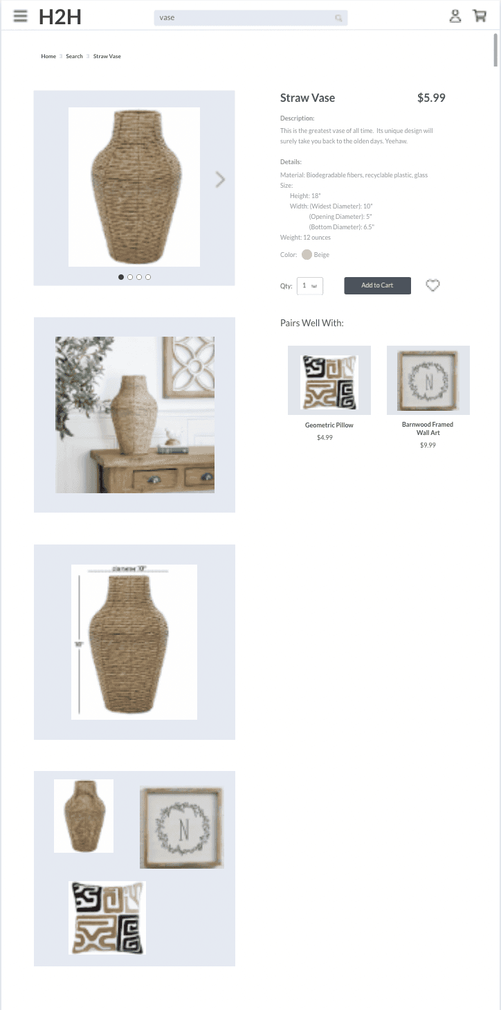
To address the challenge of helping users visualize and select home decor items more effectively, I drew inspiration from popular online retail applications. The "Ways to Wear it" feature on the Hollister clothing app served as an example of how to showcase items together for easy visualization.
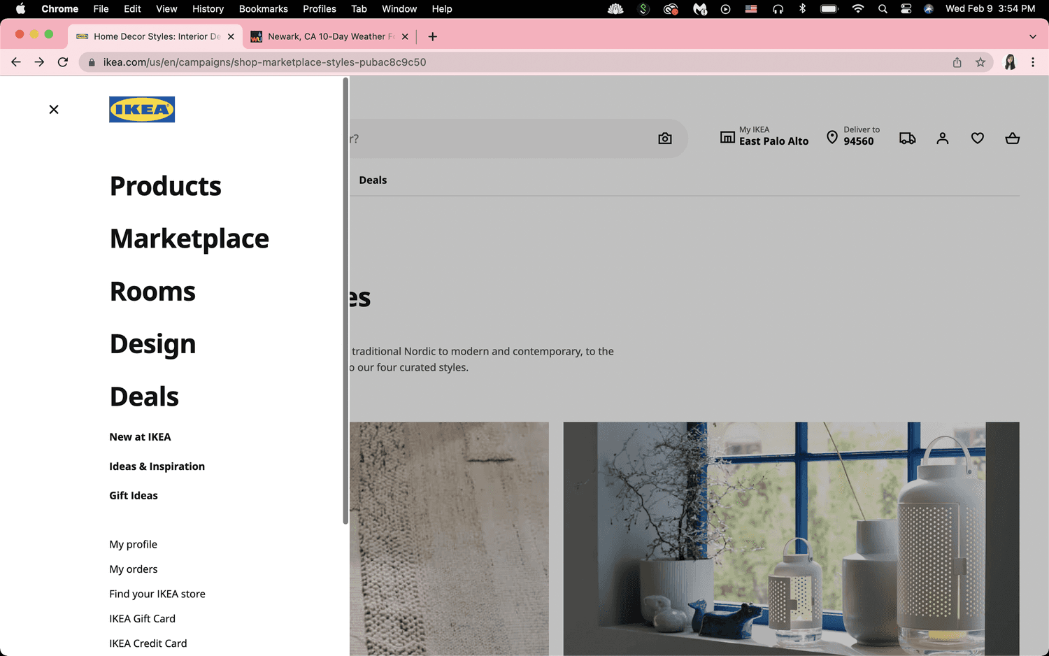
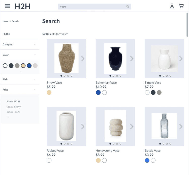
I also looked to the Ikea website for organizational inspiration. Ikea's website offered multiple entry points for users, such as shopping by item, marketplace, and room, providing design inspiration photos for those unsure of their preferences. They also enabled interactive product views by hovering the cursor over an item, allowing users to understand the product's size and appearance without the need to click on it. The inclusion of filter tools made it easier for users to find items within their budget.
These inspirations guided my efforts to create a more user-friendly and intuitive House to Home platform.
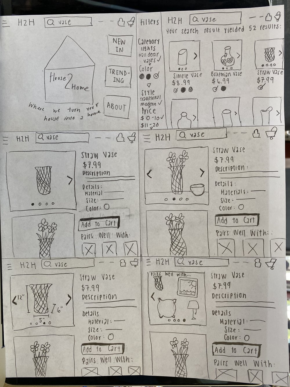
Recognizing the importance of the screen displaying search and product results with filters, I dove into sketching various concepts using the Crazy 8s method.
I selected the final sketch from the Crazy 8s exercise as the basis for the solution. Some sketches were ruled out due to potential user unfamiliarity with filters at the top rather than on the side and vertically oriented. I prioritized the feature that allowed users to view additional product images without opening new tabs or windows, making the experience more seamless and convenient.
The chosen solution involved introducing filters for budget and providing users the ability to view items without leaving the current page. The product images were displayed in a standard environment, reflecting how they are modeled and helping users visualize how these items would look in their own living spaces. This design aimed to make the search and selection process more intuitive and enjoyable for users like Maria.
In the absence of direct feedback and collaboration, I faced the challenge of proceeding with my solution for House2Home. My solo design sprint called for me to rely solely on my own judgment and expertise.
I decided to move forward with the solution I had created, as it incorporated familiar and standard features commonly found in online shops. The concept was centered around providing a user-friendly and intuitive experience. The idea was that users would easily find what they were looking for, whether they had a specific item in mind or wanted to explore options. The initial impression of the website was critical, and I aimed to make it welcoming and user-centric. A friendly image or scene on the front page, coupled with a welcoming tagline, was intended to encourage users to continue their journey.
One key focus was on ensuring users could view products as comprehensively as possible through images. While I initially considered including a "Take photo of my room" feature to enable users to visualize items in their own space, I recognized that this was impractical for a website. Uploading room photos could be cumbersome and wasn't feasible, given the platform.
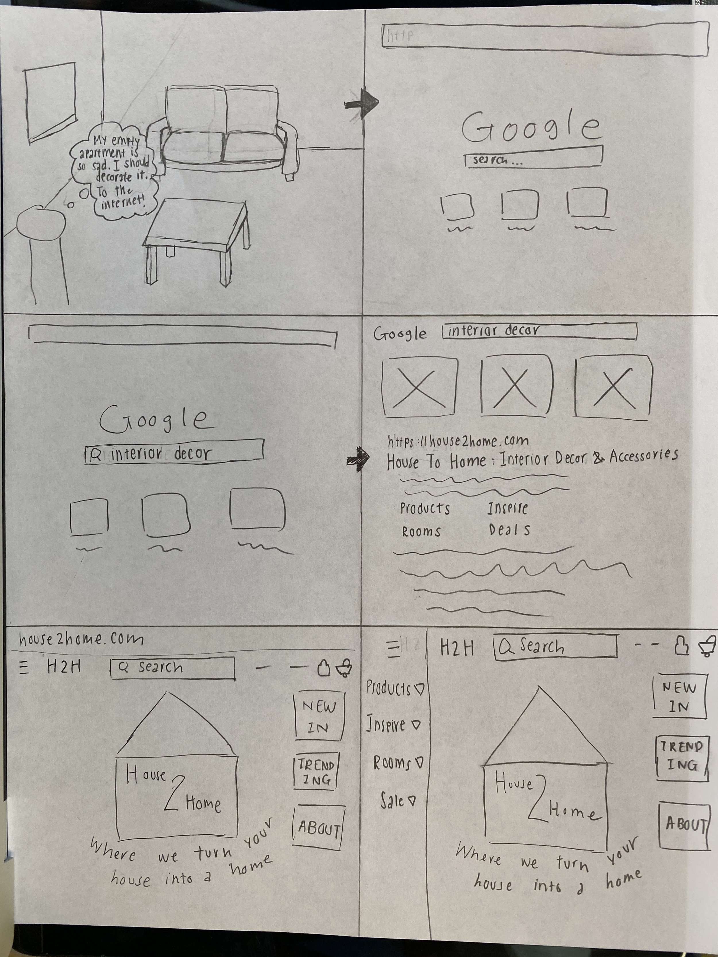
To better understand the user journey and simplify the process, I created a storyboard illustrating Maria's steps, starting from her move into her new place to checking out desired items on House2Home.
However, I encountered some challenges in this process. The complexity of mapping out the user journey overwhelmed me, and I struggled to determine where and how to start. It was crucial to strike a balance between not missing essential steps and avoiding overloading the storyboard. To overcome this hurdle, I turned to the internet for guidance. I watched YouTube videos that suggested drawing the flow of each step and determining their significance as I progressed, rather than trying to create the entire storyboard in one go. This method allowed me to prioritize the most important steps and streamline the storyboard accordingly.
While getting my ideas onto paper was one step of the journey, the next phase would be turning these concepts into an interactive product.
With Marvel as my tool of choice, I ventured into building a basic prototype for testing. The challenge was to keep the prototype as simple as possible. I constantly had to resist the temptation to add extra features or embellishments, as the primary goal was to create a straightforward, user-friendly experience.
The prototype I created followed a clear path: landing on the website, searching for something, going through search results, selecting a product, exploring the product details, and adding it to the cart. Simplicity was my guiding principle, and I ensured that every element served a clear purpose.
Drawing inspiration from other websites, I organized information and incorporated familiar icons and buttons, such as the hamburger menu, profile icon, and cart icon. The intention was to present participants with a screen that felt familiar and user-friendly.
The aim of testing this prototype was to evaluate whether users like Maria could easily find decorations that harmonized with each other within their budget. Additionally, I hoped to uncover any design flaws or usability issues that might arise during testing. I took great care to account for every possible detail while creating the prototype.
In the final phase of this design sprint, the aim was to determine whether the proposed solution was truly helpful to users like Maria, who were interested in interior decorating and design but unsure of where to start.
I conducted remote tests via Zoom with peers who shared the background of our target users: those interested in home decor. The tests ranged from 15 to 30 minutes each, and participants interacted with the prototype while providing feedback.
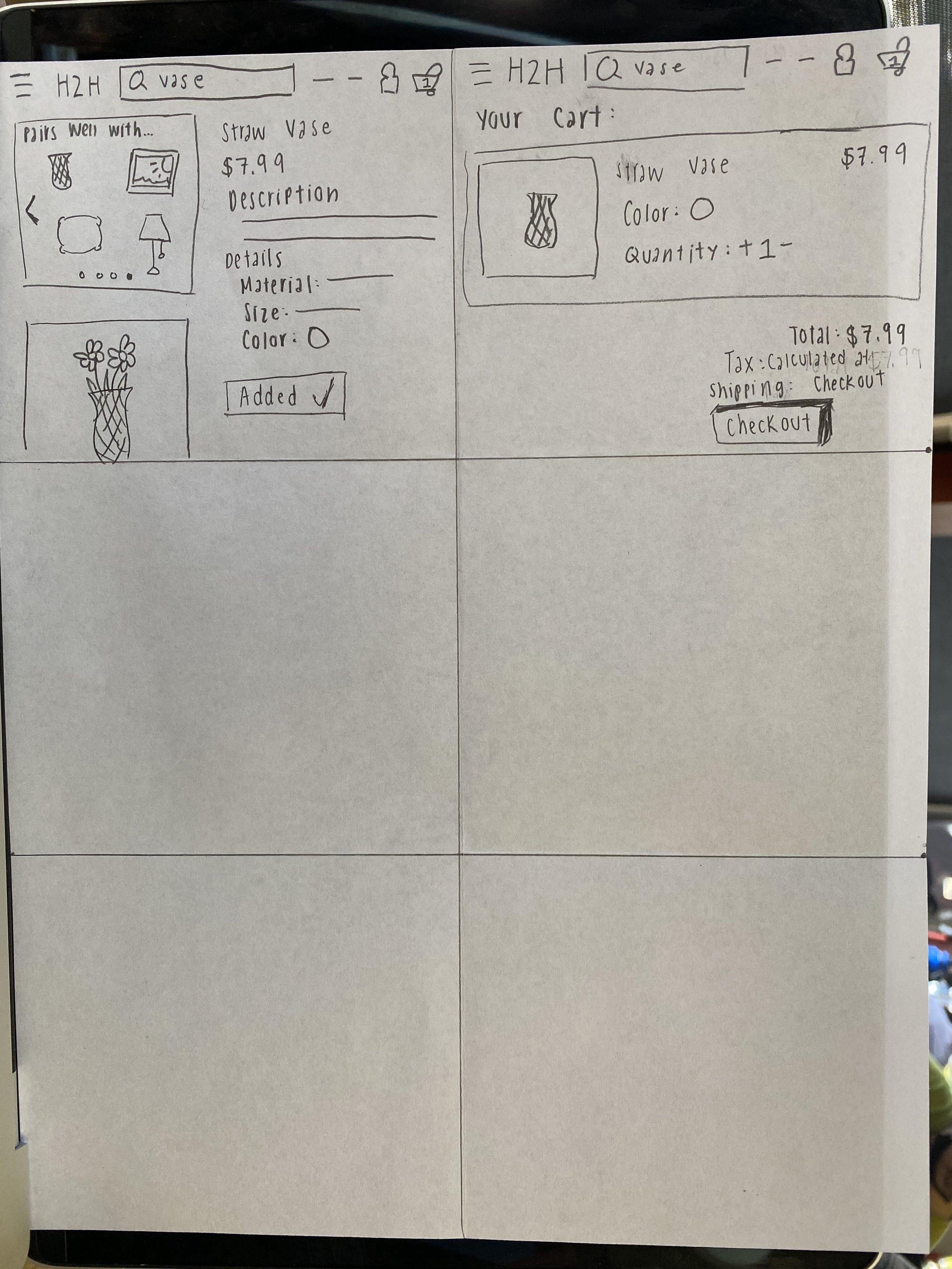
Overall, users found the design and layout of the prototype comfortable and familiar. They appreciated the ability to slide through product images on the product page, as it offered a convenient alternative to scrolling. The "pairs well" section received positive feedback, as it helped users make informed decisions about complementary items. Additionally, users liked the presence of a "remove" button in the cart and the flexibility to change item quantities.
However, participants expressed some valuable feedback and identified areas for improvement. The "suggested items to buy with the product" feature on the product page lacked context.
Participants suggested showing these items together in a room setting rather than just displaying the three items on a blank background.
A critical design flaw related to the color filters was identified. Users found it difficult to discern which colors were selected and which were not, leading to confusion.
The placement of the "pairs well with" section was another point of concern. Some participants recommended moving it to the left, right under the product images, instead of placing it flush to the right beneath the product description. Users also noted that the layout appeared cluttered and disorganized.
In conclusion, while the basic prototype helped users find their desired decor, several adjustments and additions were needed to enhance the user experience. These insights would inform the development of high-fidelity screens, incorporating user feedback to create a more refined and user-centric solution.
Reflecting on this experience, I embarked on a modified Design Sprint, my first of its kind, and it felt like I merely scratched the surface. I thrive on challenges, and working solo on this project certainly presented one. While I cherish my independence in design, I also recognize the value of collaboration. It's in the exchange of ideas and diverse perspectives that solutions truly shine. Being alone with my thoughts can sometimes feel like an echo chamber, and I prefer the richness of collaborative design and conversation.
All said and done, I'm grateful for the opportunity and pleasure of collaborating with House to Home to revamp their website. It's been a rewarding journey, and I look forward to applying the valuable lessons learned to future projects.
For an interactive prototype of these wireframes, please click here
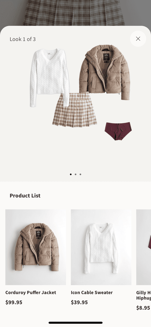
As the clothing company, Hollister, calls it, this “Ways to Wear it” section is featured when looking at any piece of clothing. In this case, I was viewing that skirt. I thought of this as a similar way to show how certain home decor items can be paired together and how they look together, like how these clothing items are shown together in one picture. Additionally, it’s convenient and helpful to list all the items shown for easy access to them. This way, the user doesn’t have to stress about finding the items shown.
Hoillisrer app: "Ways to Wear it"
Maria finally found her dream apartment: It features in-unit laundry, her own bathroom, and is on the ground floor. Only $900/month.
After moving all of her stuff in, which surprisingly took shorter than expected, she stands there, looks around, and comes to the sad realization:
This looks really depressing and empty.
What good is a dream apartment if it makes her feel so bleak?
No problem. Time to go to the one place everyone goes to when they have a problem: the internet. However, hours of looking at decorations online only presented a new problem; now she can’t choose what to buy. She really liked that vase, but does it go well with that pillow she chose earlier? How much would it all cost?
This is exactly what many of our users of House to Home are burdened with. Where to start? How to start? In addition to what to get, what about how much our users are willing to pay? We interviewed a few of our users for insight on their experience when shopping for interior decor. Finding things you like is simple enough and straightforward; it’s visualizing how they would look in your living space or even just how they all look together that is hard as Dan states:
“I find lots of cool little items that I like, but I never know if they’ll all look good together in the same room until I buy them. Usually, I get overwhelmed and end up not buying anything.”
We want to find a way to help these people to achieve their desired look, without compromising quality or quantity. By quantity or quality, we are discussing the fact that users do not want to have to spend huge amounts of money on a single item, but also do not want to buy many items that aren’t necessary. Our users voiced that it is very important to them to stay within their budget.
How might we ease the overwhelming and difficult task of interior decoration without compromising our user's money or time?
Day 1: Map and Understand
Day 2: Sketch
Day 3: Decide
Day 4: Prototype
Day 5: Test
A new House to Home
Reflection


End to end user experience
Ikea’s organization of their catalogue

How Ikea models their products
Ikea’s organization of their catalogue
Crazy 8s Sketches
Solution Sketch
Page 1, 2, 3 of Storyboard
Search results page wireframe
Search results page wireframe
Home Screen Wireframe
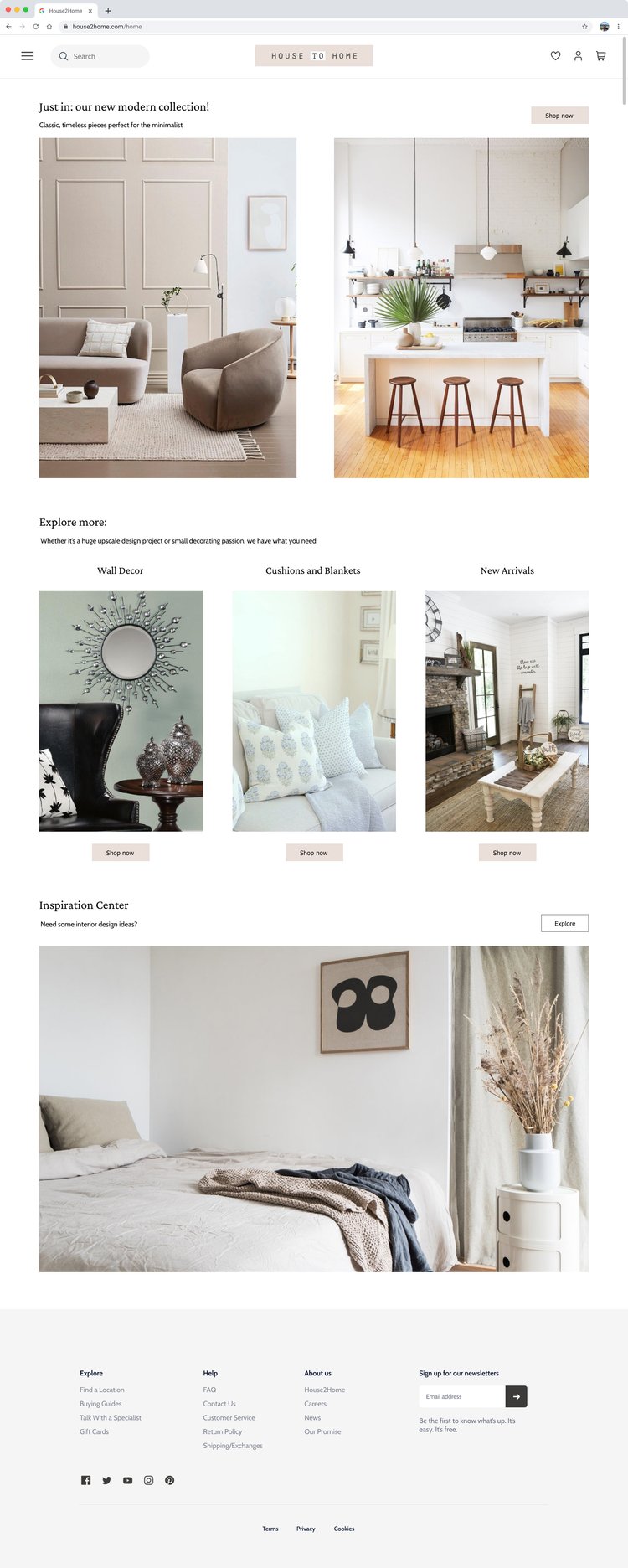
Hi-Fidelity Home page
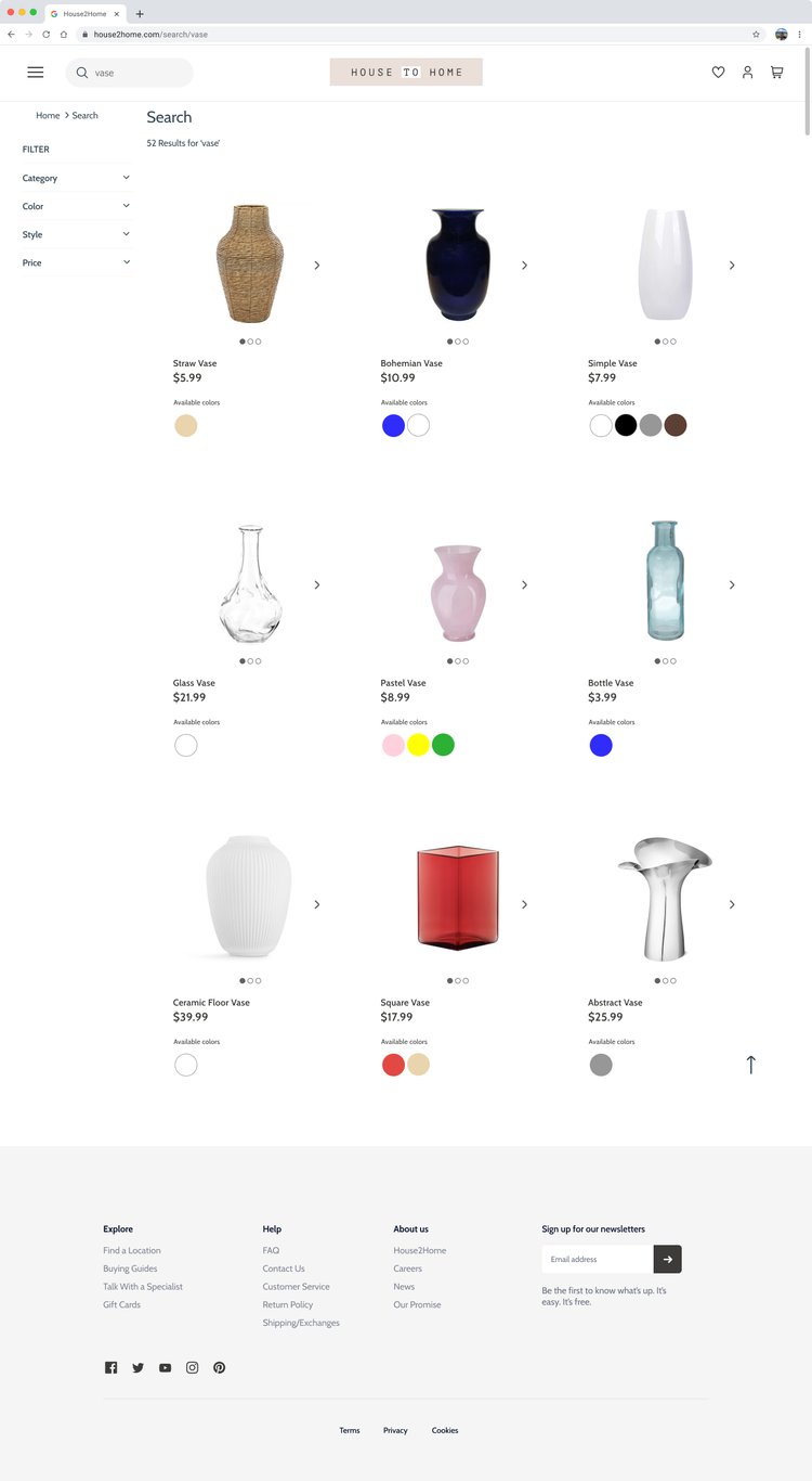
Hi-fidelity Search results page
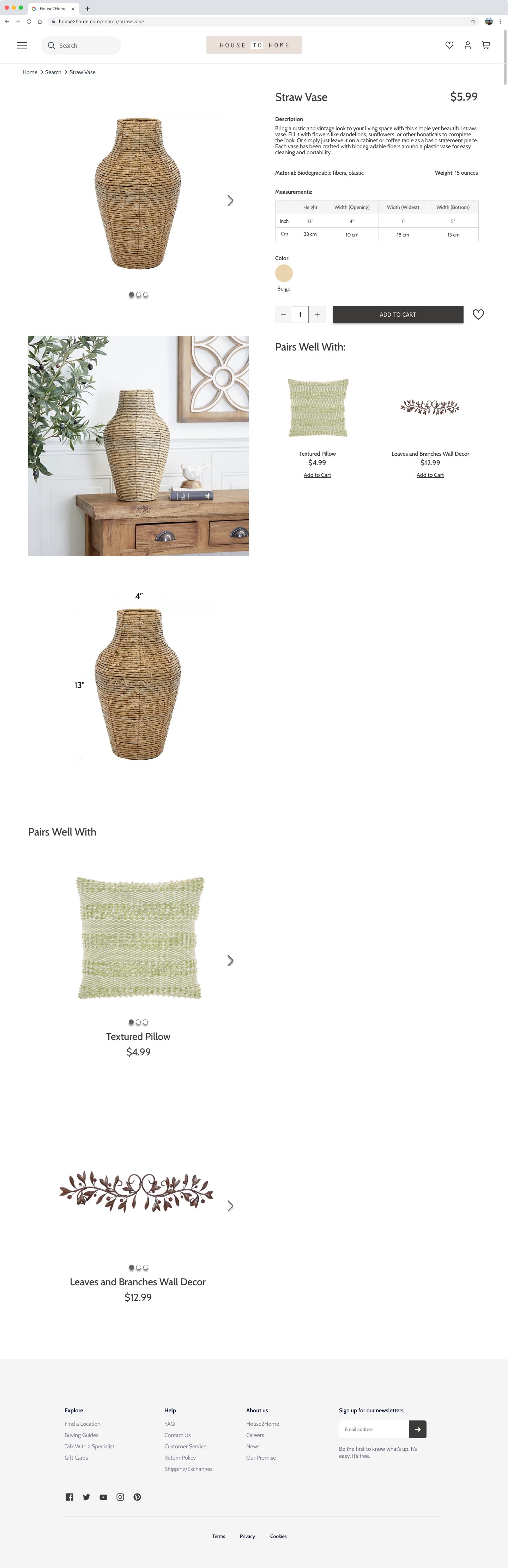
Hi-fidelity Product view page